Pin Design Tips: 9 Rules for Pins That Get Saved
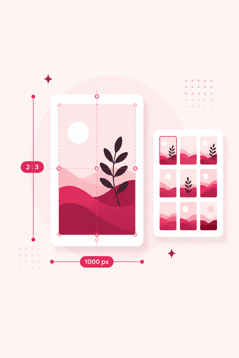
Keywords get your pin shown; design gets it saved — and saves feed back into ranking. You don't need to be a designer. You need nine repeatable rules and a template. Here they are.
1. Vertical 2:3, always
1000×1500px. Anything else gets cropped or shrunk in feeds. Full specs in the size guide.
2. One idea per pin
A pin is a poster, not a page. One promise, stated big. If you're cramming three messages in, make three pins — they'll all count as fresh.
3. Text overlay readable at thumbnail size
Most people see your pin at postage-stamp size in a grid. Zoom your draft to 10% — if the headline isn't legible, it's too small or too thin. Bold sans-serifs survive; script fonts die (use them only for accent words).
4. High contrast between text and background
Put text on a solid or semi-opaque block, or darken the photo behind it. Text directly over busy photos is the most common amateur tell.
5. Warm, bright photos beat dark, moody ones
Pinterest's feed is light; bright pins pop against it. Aspirational-but-achievable imagery ("I could do this") earns more saves than pure perfection.
6. Make the headline a benefit
The overlay is a mini ad: "Small Closet? 12 Fixes That Double Space" beats "Closet Organization." Match it to your keyword so design and SEO reinforce each other.
7. Brand it lightly
Your site name or logo, small, at top or bottom. It builds recognition across the grid and deters pin theft — without shouting.
8. Use consistent templates
Pick 2–3 layouts and reuse them with different photos, colors and headlines. Consistency speeds you up and makes your account visually recognizable. Vary enough that pins don't look like duplicates.
9. Leave breathing room
Margins around text, space between elements. Cramped pins read as spam; whitespace reads as quality.
Pair great design with great keywords
Generate keyword-led titles and score every pin before publishing — free, no login.
Open PinRank →Frequently asked questions
What tools should I design pins in?
Canva is the standard for templates and speed; Figma if you want more control. Both export 1000×1500 easily.
Should every pin have text overlay?
Not always — pure photo pins work in decor, food and fashion. But when clicks are the goal, a headline overlay usually wins. See getting clicks.
How many template variations do I need?
Two or three per content type is plenty. Rotate colors and photos to keep pins fresh without redesigning from scratch.